Wayfinding orThe Art Of Navigation
Wayfinding has existed for centuries and is still very relevant today, but its shapes, forms and to some extent, purposes have evolved over time as the world has seen new landscapes and spaces come to life. People have to adjust to new surroundings and with the new digital era, new tools appeared that impacted wayfinding and its purpose. Not only is wayfinding a tool to help people navigate but it has also become a tool to learn from user behaviors and connect with them through more targeted marketing techniques. In this paper, the history of wayfinding and an overview of the different wayfinding principles and information systems used in built environments will be looked into. With this background and discussions with the architecture and interiors teams at BAM, recommendations of how to create a clear wayfinding plan and showcase examples of these systems will be offered. The history of wayfinding along with the principles and information systems used in built environments help to create opportunities for a clear wayfinding plan. In addition to adding to the built environment experience, the evolution of wayfinding systems can help mitigate the spread of viruses in light of Covid 19 and respond to future needs of a post pandemic world.
Wayfinding History And Definition
Wayfinding historically refers to the techniques used by travelers to discover unmarked routes. These techniques include but are not limited to dead reckoning, maps (earliest known maps are of the stars), compass, astronomical positioning or celestial navigation, radio navigation, and more recently, global positioning also known as GPS (1978).
In modern society, the term wayfinding has been used in the context of architecture to help the user experience in orientation and navigation within a built environment. Kevin A. Lynch used the term (originally “way-finding”) for his 1960 book The Image of the City, where he defined way-finding as “a consistent use and organization of definite sensory cues from the external environment.” According to the Society for Experiential Graphic Design (SEGD), “Wayfinding refers to information systems that guide people through a physical environment and enhance their understanding and experience of the space.”
fun fact
According to National Geographic, sophisticated celestial navigation is still being used today by NASA and other space agencies for many of their missions outside the Earth’s atmosphere. This approach was used by the Apollo program to chart their way to the moon and back. More recently, the Mars Exploration Rover uses celestial navigation to communicate information back to engineers and researchers on Earth.
Wayfinding has become more prominent over time due to the increasing amount of complex built environments. It is used across many industries, but is more easily identified in the design of healthcare facilities, research campuses, education campuses, transportation hubs (subways, airports), and cultural centers (museums).
Urban and architectural environments have grown busier and more complex over time with more people, new buildings and expanding new spaces wide. The growing complexity of architectural environments requires the use of visual cues for visitors to navigate on their own. These cues can be maps, signage, symbols or colors. Wayfinding systems help guide the users through a more pleasant, safe, or even potentially immersive experience.
Wayfinding may be used in many ways, but the most commonly used tools are maps, signs and floor markings created in both static and digital forms. New tools for wayfinding such as mobile apps have appeared with new technologies.
Static and Digital Wayfinding Maps
Wayfinding maps are a representation/plan of the surrounding environment and indicate where a person is situated to help navigate within the space.
Digital versions of maps are now more widely available and while they have a similar purpose to static maps, they are more interactive and require the user to engage with their mobile device.
Static Signs
The most common forms of static wayfinding signage may be classified into four categories:
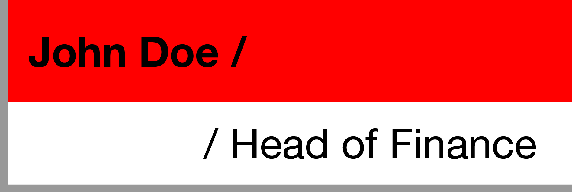
1-Identification Signs
Identification signs inform the user when they have arrived at their destination.
Examples of Identification Signs
- Door plaques (John Doe, Head of HR)
- Departmental markers (Accounting and Finance; Marketing)
- Landmark signage (Donor Plaque; Historical Marker)
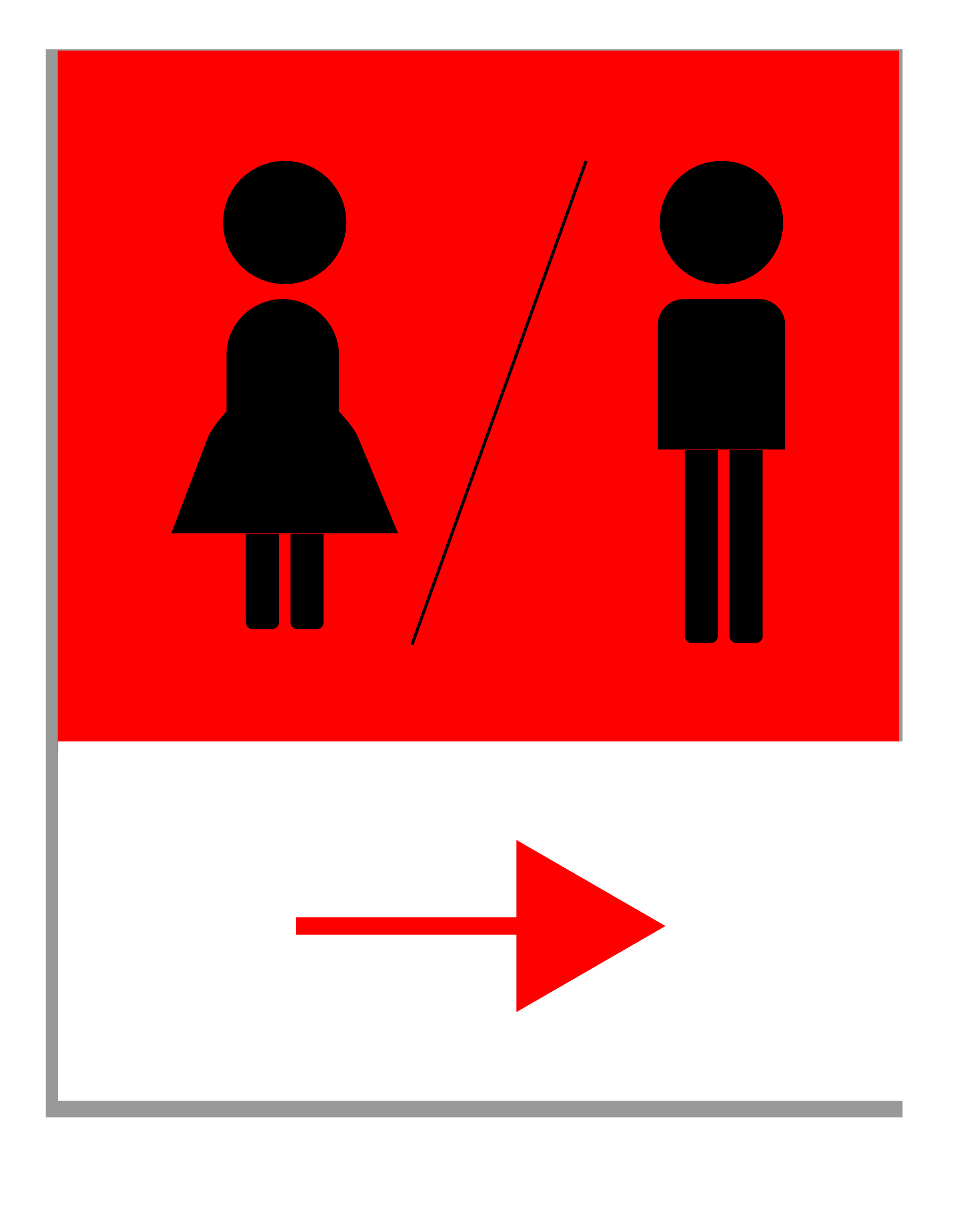
2-Directional Signs
Directional signage gives people the direction they need to follow to reach their destination. They usually have arrows pointing to the direction a user needs to take to reach their destination.
Examples of directional signs
- Junction signs (left to bathroom, right to outdoor patio)
- Directory signage (Doctor Smith, 9th floor, GP Department)
- Directional colored lines on the floor
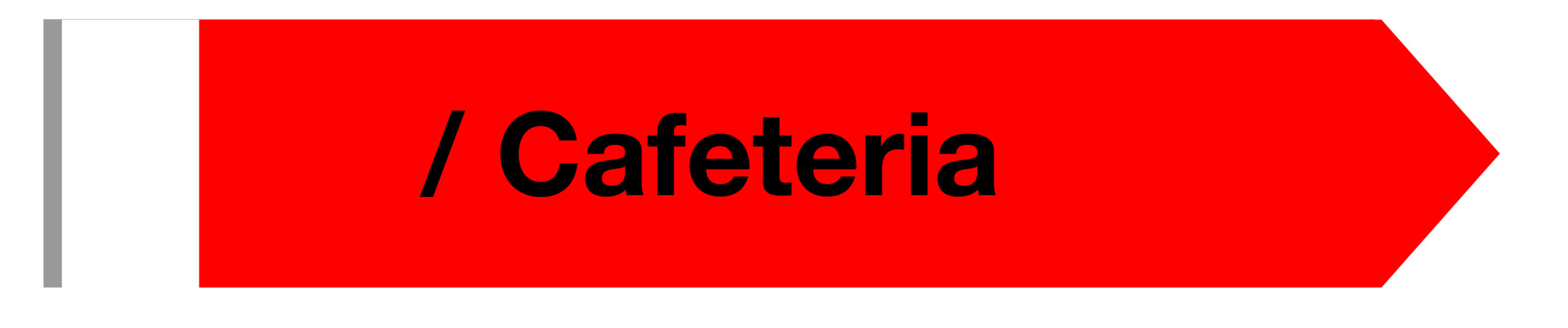
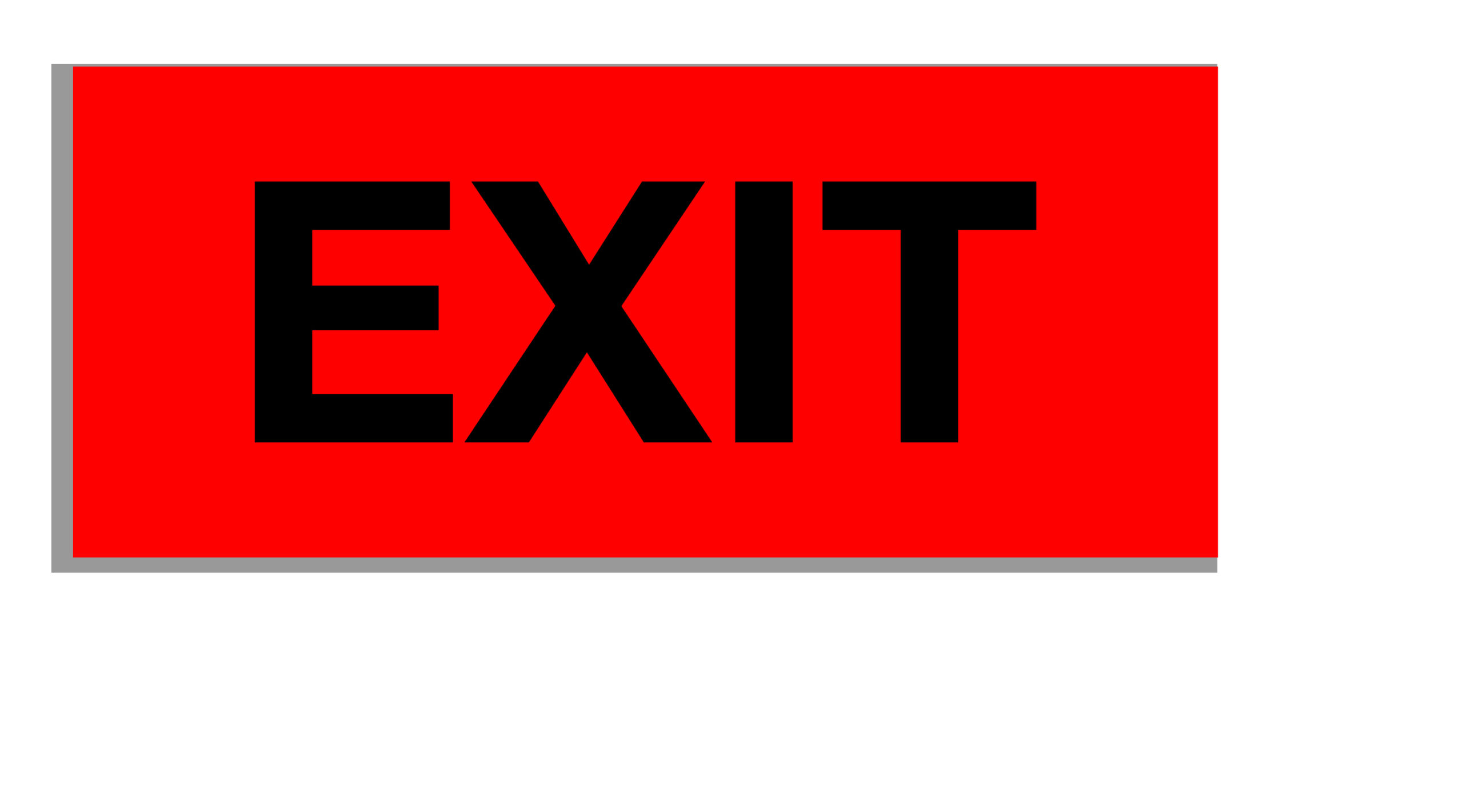
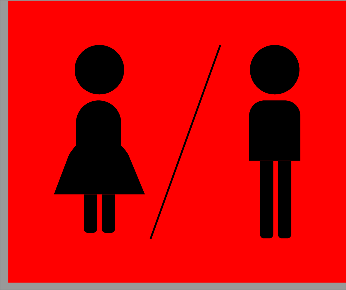
3-Informational Signs
Informational signage gives people the information they need when located in a specific area. They are usually found in entry and reception areas such as lobbies or waiting rooms. This signage gives primary information to the user including the location of the bathrooms, when the business closes, and/or how often the area is sanitized.
Examples of Informational Signs
- Amenities and accommodations (Free Wi-Fi; elevators)
- Facilities signage (bathrooms; exits; cafeteria)
- Business information (hours of operation; address numbers)
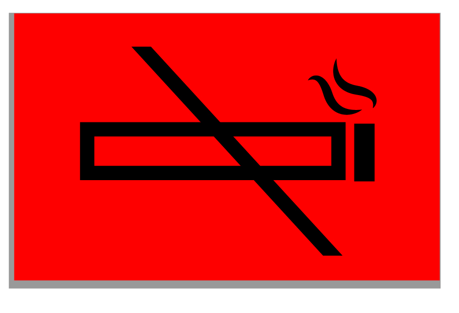
4-Regulatory Signs
Regulatory signage focuses on safety and liability concerns. It also sets boundaries for the users by telling them where they can and cannot go or what they can or cannot do. It reinforces rules, safety and privacy standards. Regulatory signs are direct and leave no space for ambiguity: Employees Only, Caution! High Voltage!, No Smoking, etc.…
Examples of Regulatory Signs
- Rules and regulations (no smoking; no firearms)
- Compliance standards (ADA accessibility; high voltage sign)
- Access control (no entry beyond this point; employees only)

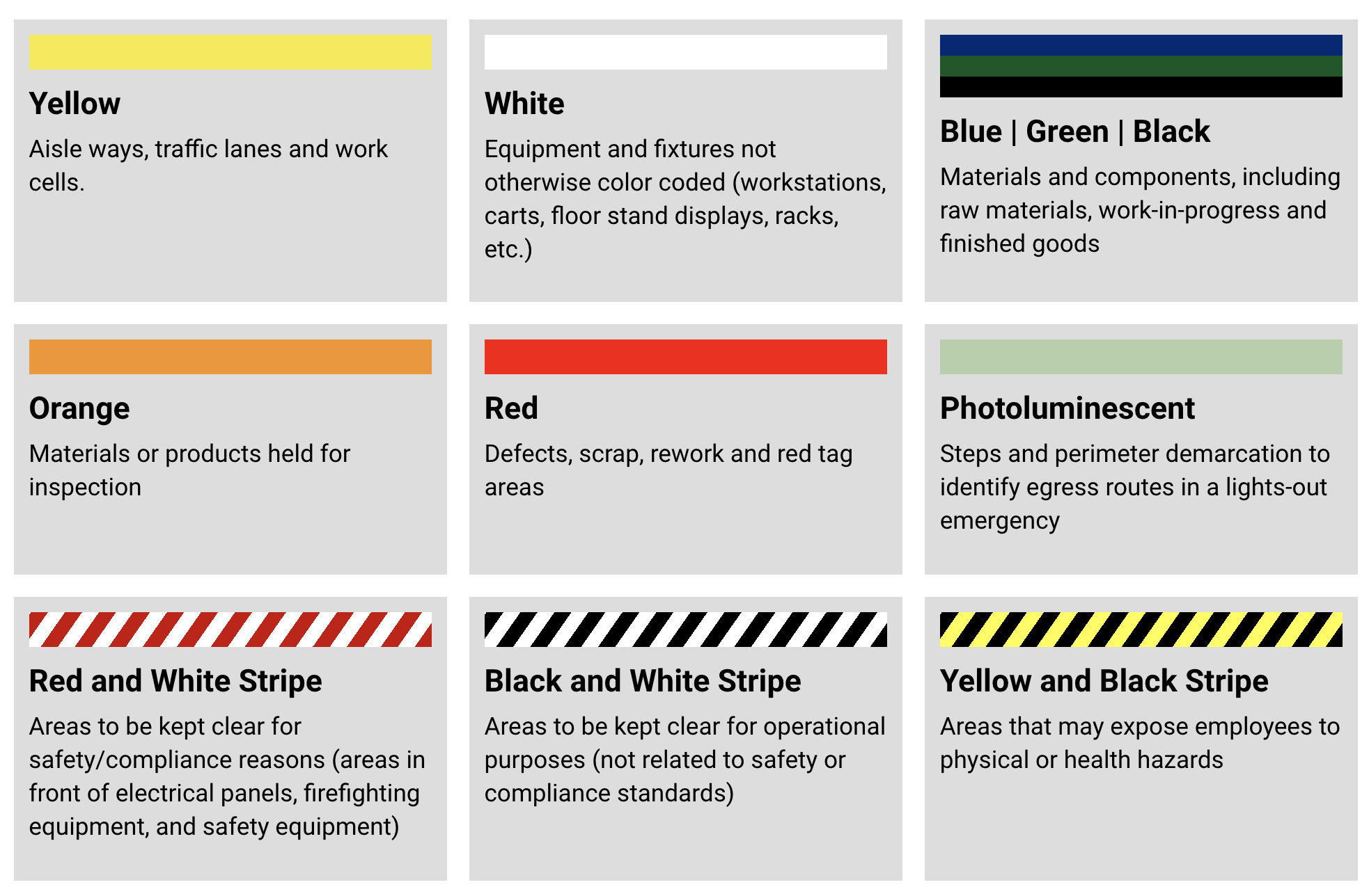
Floor Markings
Floor markings, just like signs, have a different use and purpose but are similar in nature; identification, directional, informative, and regulatory floor markings can be identified. The brand Brady has developed a concise explanatory chart that helps bring sense to floor markings, at least in industrial environments.
Wayfinding, a Hybrid Discipline
Wayfinding designers usually have a hybrid of graphic, architectural, and environmental design skill sets. The job descriptions typically require a BFA in Graphic, Industrial or Interior Design, Architecture, or Urban Planning. Wayfinding designers often work closely with architects and interior designers to implement an effective wayfinding system for any new or remodeled space. This role requires close collaboration across disciplines and a good understanding of the space, plans, elevations, finishes and installation details. A wayfinding designer should be able to read architectural plans such as:
- Reflected ceiling plans (RCP), as this is where fire exits are indicated
- Finish, floor, and elevation plans, as these might be useful for visual wayfinding to depict painted arrows and symbols
- Partition plans/furniture plans, since they give a sense of how the space is occupied by furniture and how people would move through the space
A wayfinding designer also needs to implement an effective wayfinding system that speaks to and supports the brand voice, message, and mission. Users need to identify and recognize a company when walking into the space, and the design needs to be cohesive with the overall brand tone. Wayfinding design requires a good understanding of general graphic design, typography, type settings, color theory and iconography design as well as an equally strong understanding of materials and finishes. The more technical mounting aspects are also important skills, as a wayfinding plan must account for these details. Wayfinding designers should consider the different types of materials used in the space, how they will interact with one another, and what is involved with installation.
7 Steps to Create a Clear Wayfinding Plan
Wayfinding projects require a tight, well organized plan as there are many moving parts involved in the process. Seven steps to help create an effective and cohesive wayfinding plan include:
Step 1 – Conduct a Space Audit
It is essential to understand the space in which the wayfinding system will be installed. As specified above, the team working on the wayfinding system needs to be able to read architectural drawings and documents to develop a well-rounded wayfinding plan.
Step 2 – Define Signage Types
Once the team has an understanding of the space and the needs of the project, a list of signs that will be needed is then put together. Signage types are identified and attributed a “type name,” usually a generic, abbreviated legend name such as sign type A1, A2, B1, B2, D1, D2… depending on the vendor. Each sign has a particular and specific usage. As covered above, these signs are usually identified and distributed into categories such as identification, directional, informational, and regulatory.
side note
All elements within a wayfinding plan must be clearly defined and use concise and simplified/coded nomenclature to help with clear communication to avoid any confusion for vendors down the line. This is especially valuable when the design team is dealing with large spaces and multiple floors.
Step 3: Identify Graphic Elements: Typography, Iconography and Colors
These graphic elements are crucial to create a clear and immersive wayfinding and branding experience.
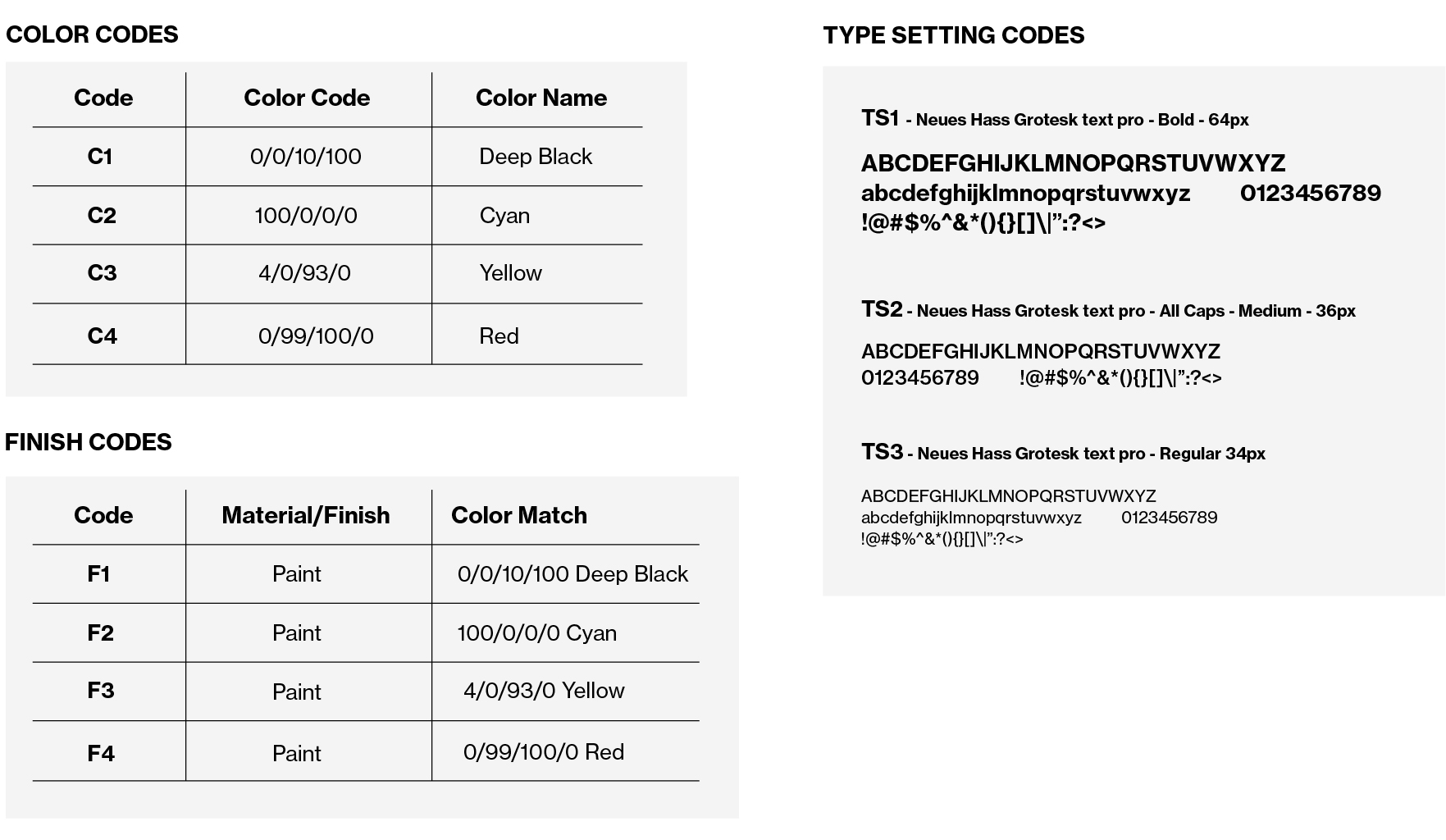
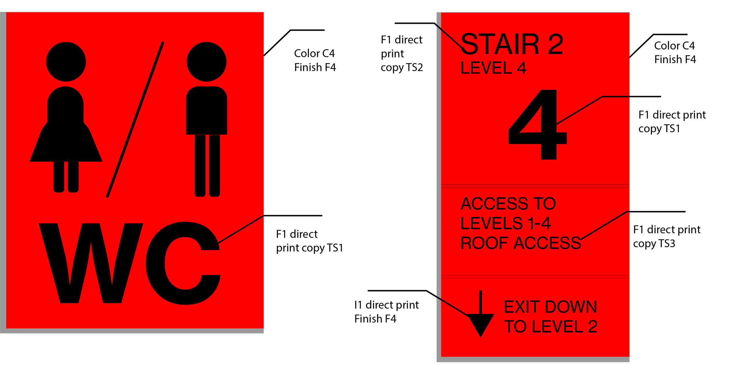
Once the types of signs have been identified, graphic design elements need to be defined. If the client has an established visual identity, using their branding guidelines will help define typography, iconography style and colors/finishes. If not, this might be a chance to get creative and define those parameters for them. The typography and type setting need to be readable; the color palette must be easy to differentiate, and icon style must be easy to identify and recognize. It is also a good idea to allocate a code to each color (C1, C2, C3…), finish (F1, F2, F3), icon (I1, I2, I3…) and type setting (TS1, TS2, TS3…) which will be referenced during signage layout design and production.
Step 4: Define Graphic Layout on Signage: Types and Element Settings
Once the graphic elements have been established, they must be incorporated into the different types of signage. The elements must be logical and cohesive to avoid any confusion. Users will acclimate themselves with a certain hierarchy of elements when navigating through the environment, so it is essential for the hierarchy to be the same and accurate through the entire journey.
Step 5: Mockup Typical Installation Elevations
It is important to establish signage types for a project and where they will be used. Elevation plans are usually best to mock this up, as elevations may show signage that will be used on corner walls, by elevators or on glass doors. Usually, dimensions are also provided so the company in charge of installation knows exactly where the signs should be placed, and to ensure consistent placement for all signs throughout the entire building.
Step 6: Confirm Mounting Instructions
Each sign must be correctly mounted depending on both the size of the signage and the surface on which it will be installed. Signs that will be mounted on solid walls will require different mounting instructions than those mounted on glass doors.
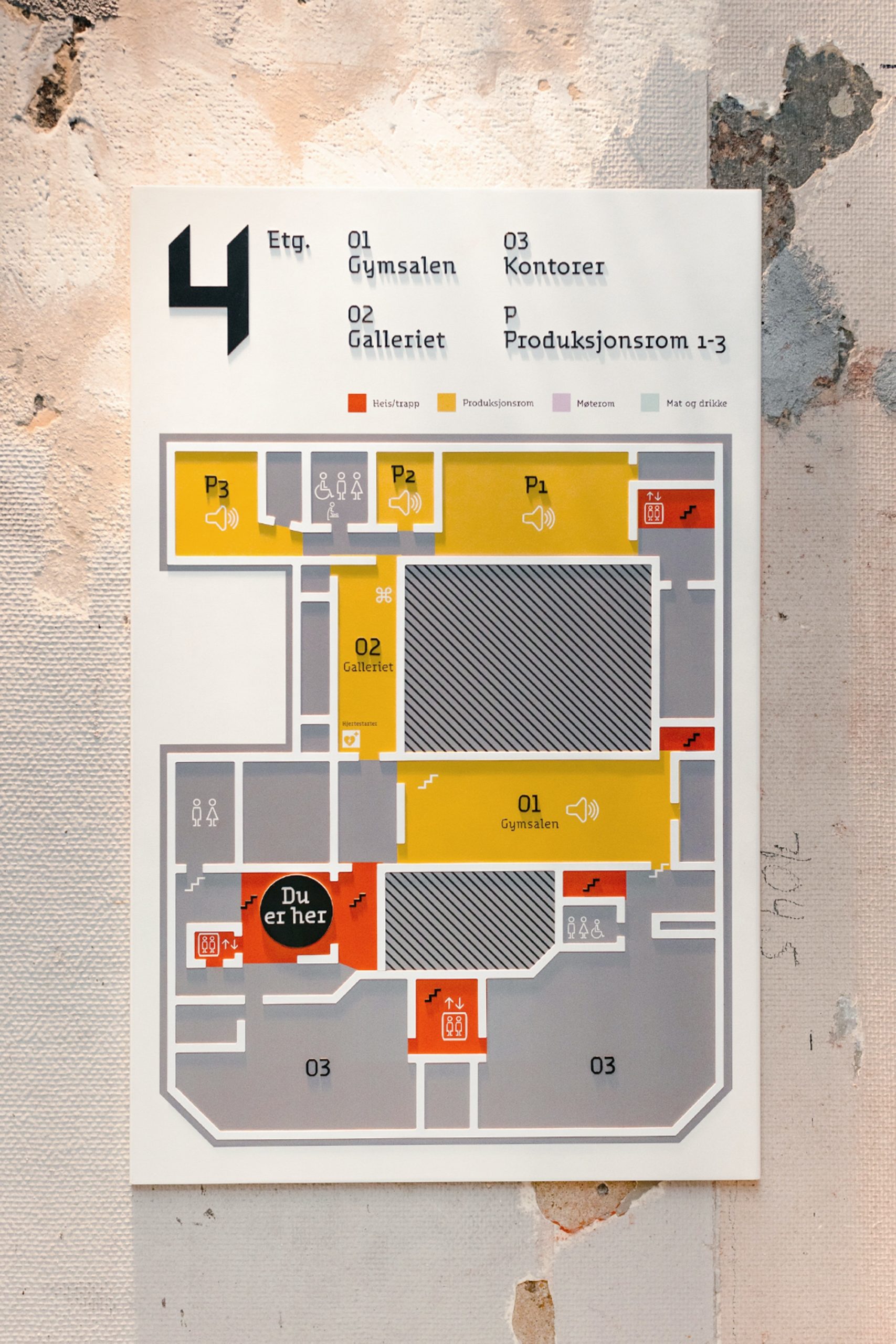
Step 7: Create Sign Location Plans
Finally, once all items above have been established, a clear sign location plan must be created to reference all signage that needs to be installed on all the floors of the building. Usually, floor plans are used and marked up with signage codes that clearly show sign locations with the use of arrows. This plan is then distributed to the company in charge of producing and installing the signs within the space.
Wayfinding, the Graphic Design & Branding Component
Wayfinding is not just about giving the users direction; while this is the primary intent, it can also support a brand identity. A brand can show its personality and tell a story through wayfinding. Creating a branded wayfinding system helps users understand the brand, the services offered, and help them identify with the brand. When used correctly, wayfinding is another way for the modern brand to build a relationship and loyalty with their audience through an immersive experience and strong customer service.
Wayfinding Case Studies in Multiple Industries: A Showcase
Art centers, healthcare facilities and transit systems have been particularly forward thinking when it comes to wayfinding. They have combined traditional wayfinding tools such as static signage alongside more modern ones such as touchscreen technology, apps, and digital signage to help guide visitors in and around their facilities.
Below are three well-known examples from each of these industries that are particularly compelling wayfinding case studies to showcase.
Transportation Industry
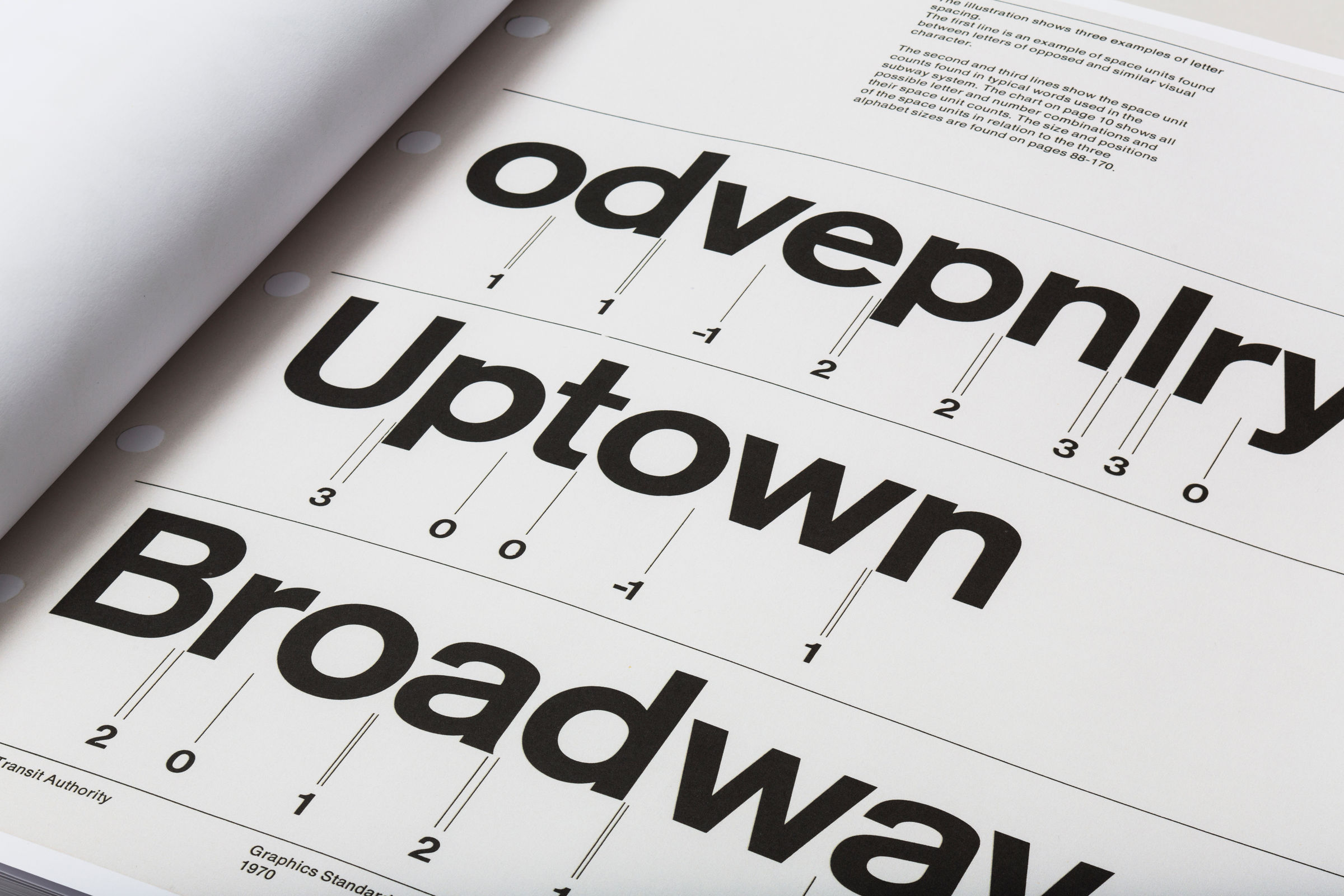
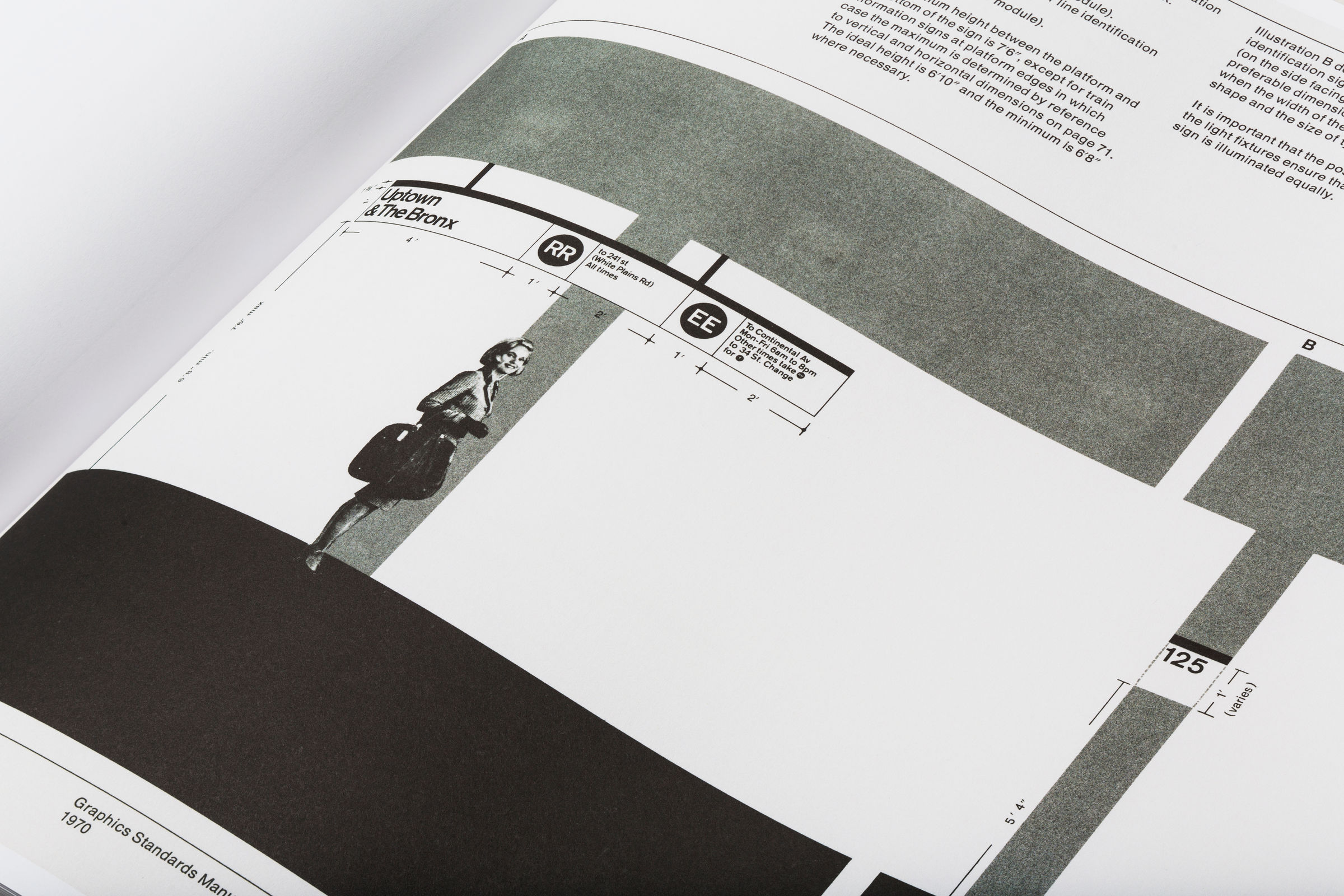
Wayfinding in Transportation: New York City Transit Authority
Designer: Massimo Vignelli – 1970
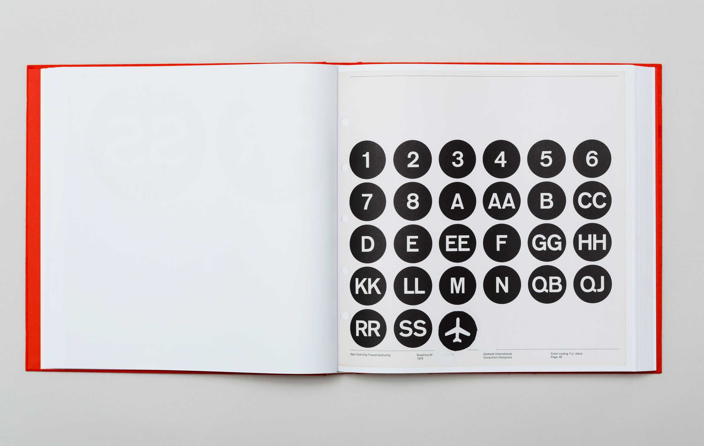
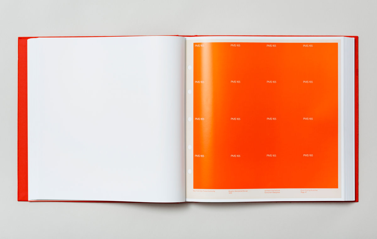
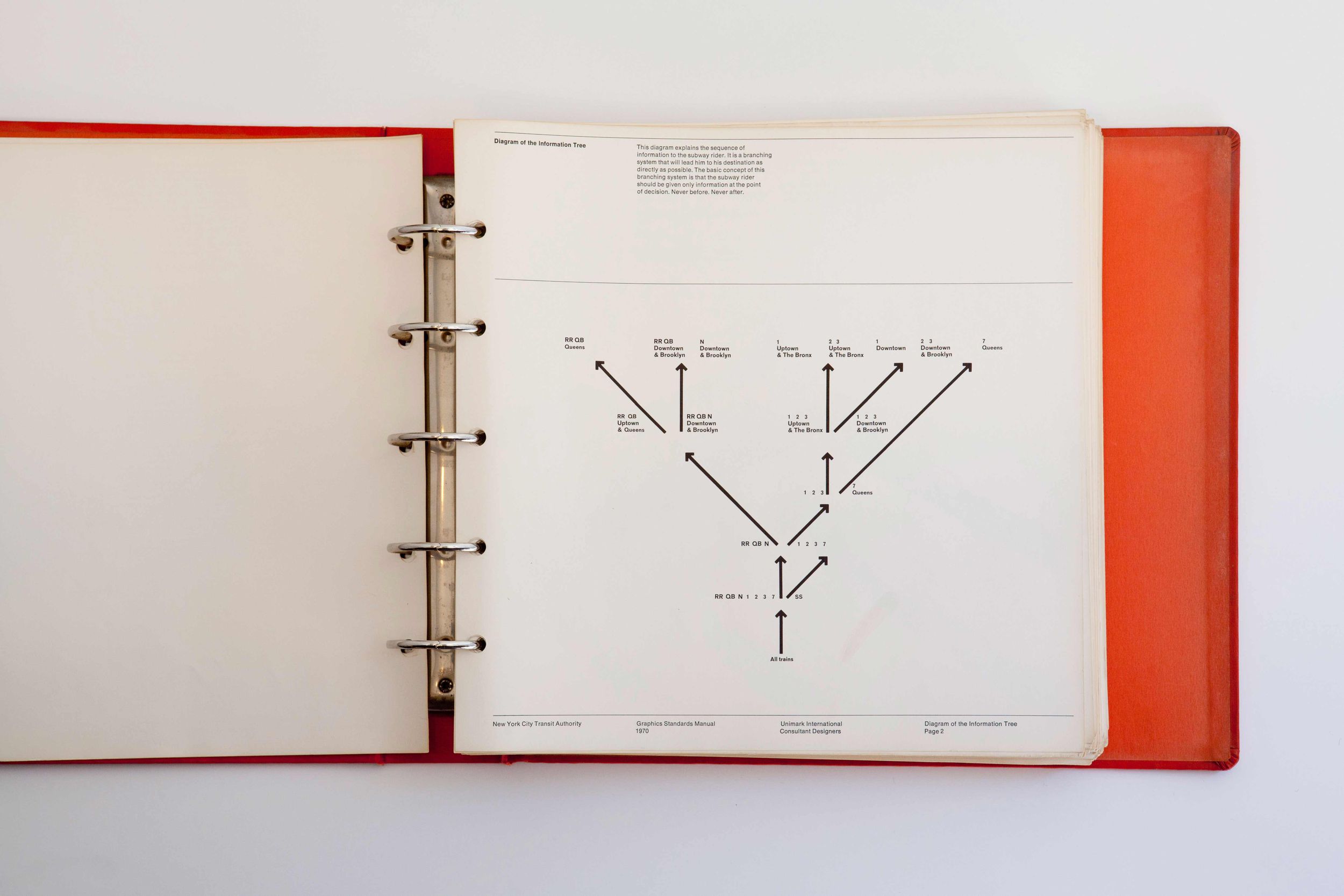
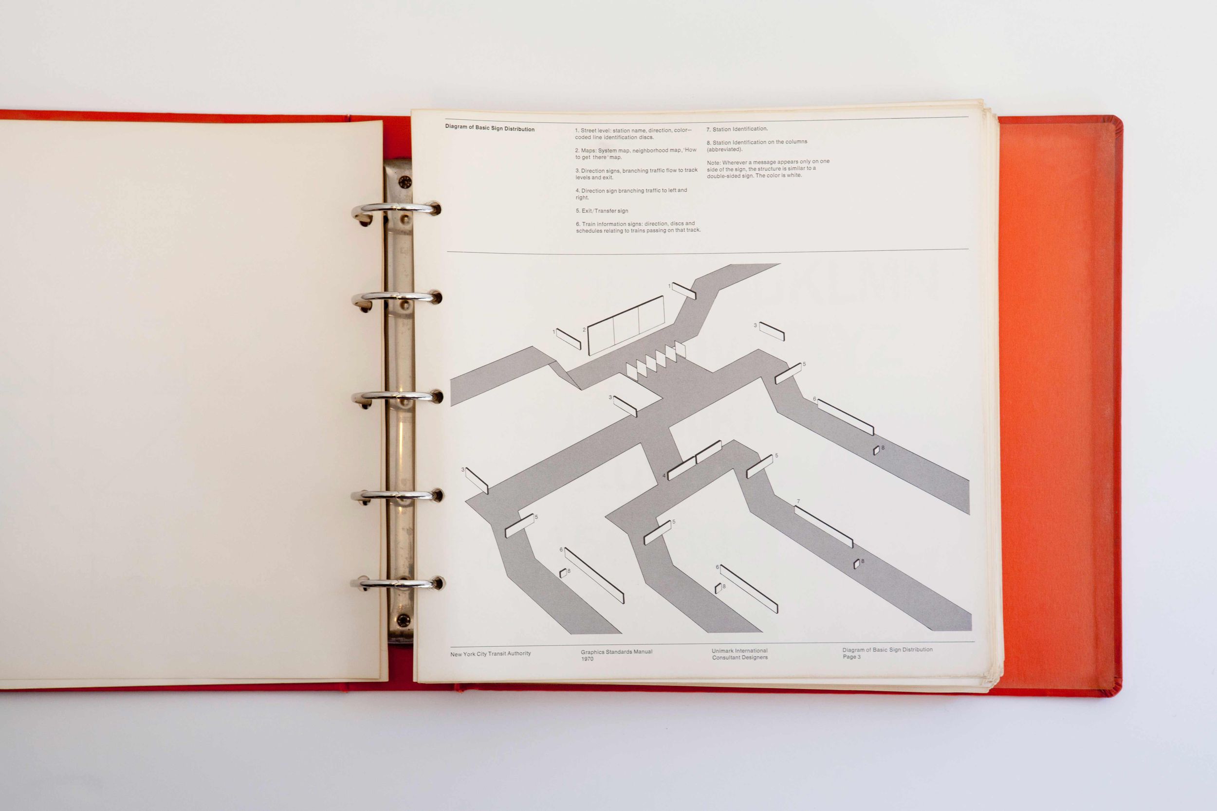
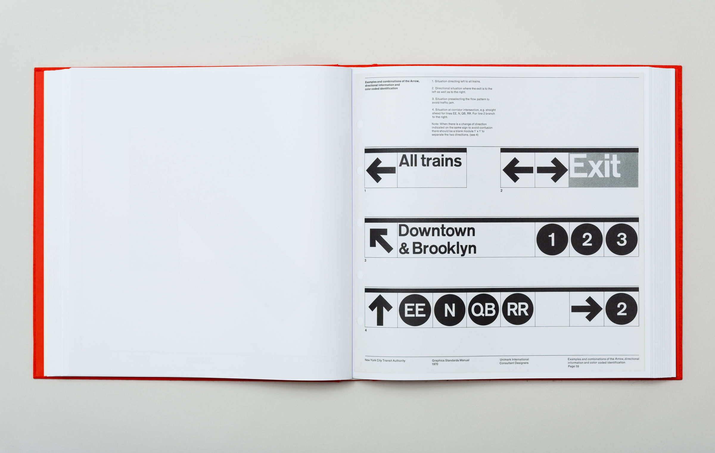
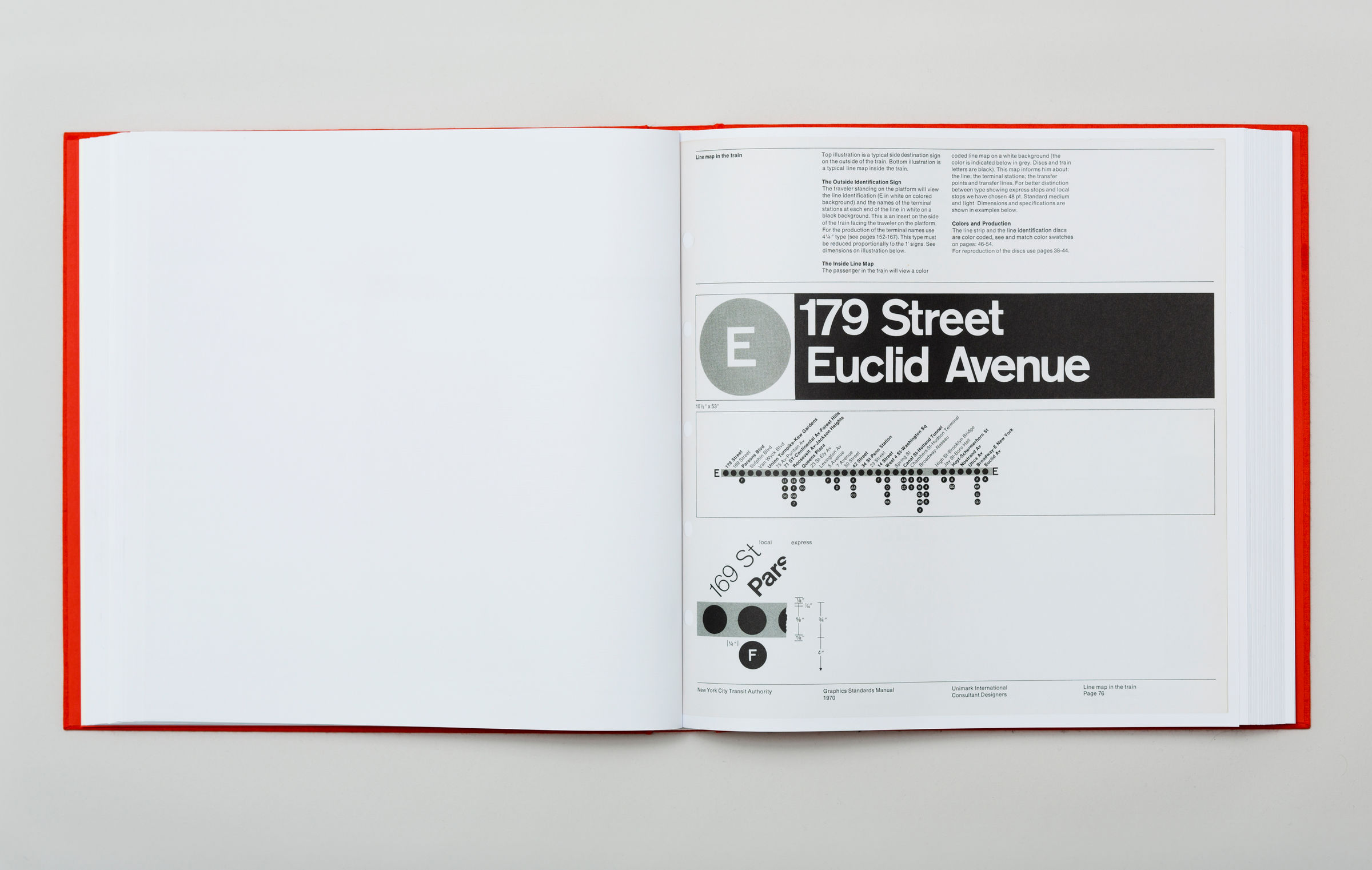
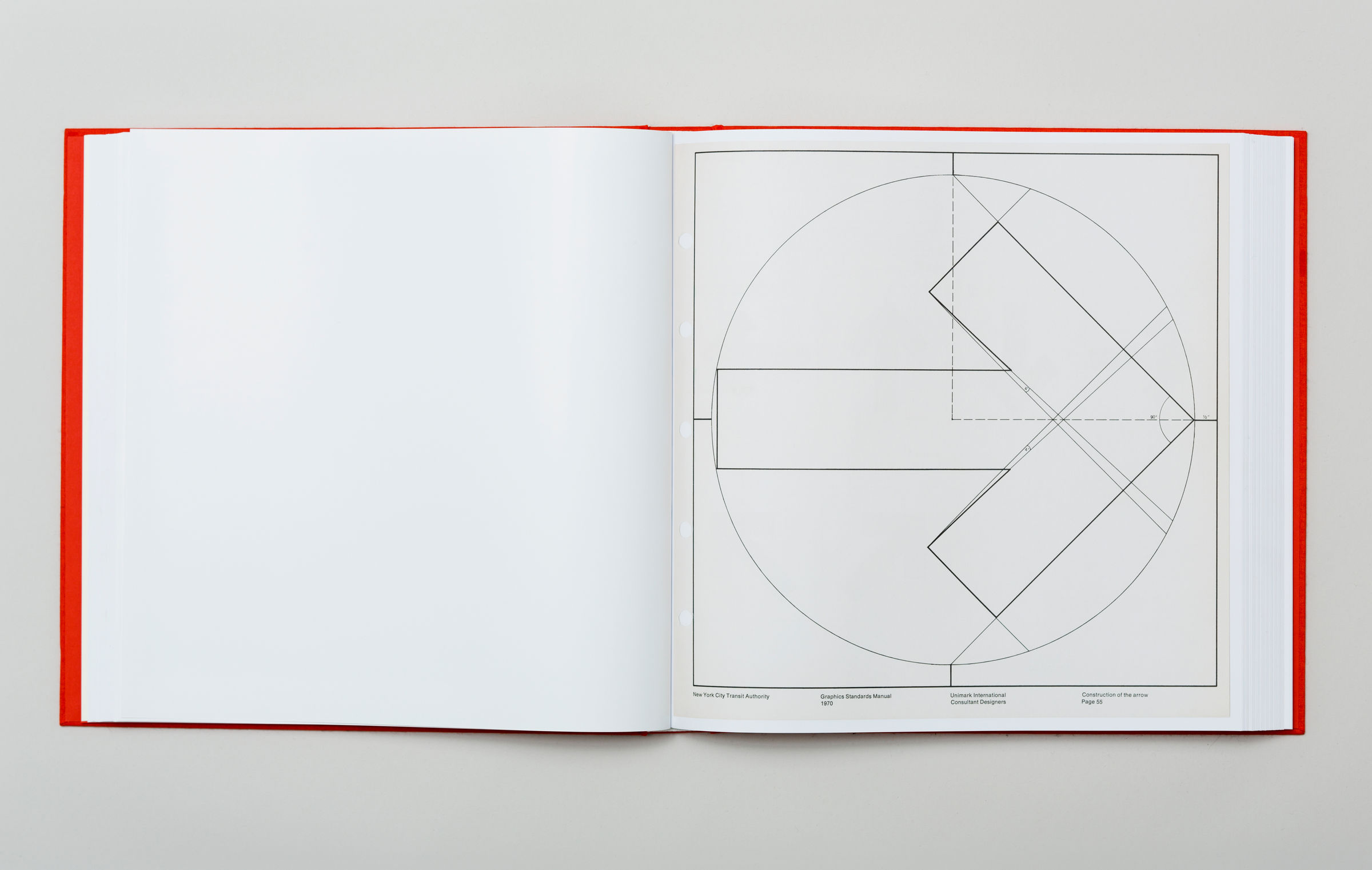
One famous transportation wayfinding case study that will resonate with any graphic designer is, of course, the New York City Transit Authority developed and designed by Massimo Vignelli and his team at Unimark International Consultant Designers. The reason why this specific case study is interesting is that the New York Transit Authority continues to use Unimark-created trademarks today, and anyone familiar with the MTA and the NYC Subway will recognize it. It is a solid example of effective wayfinding and engaging graphic design work for a very busy and massive urban scale setting.
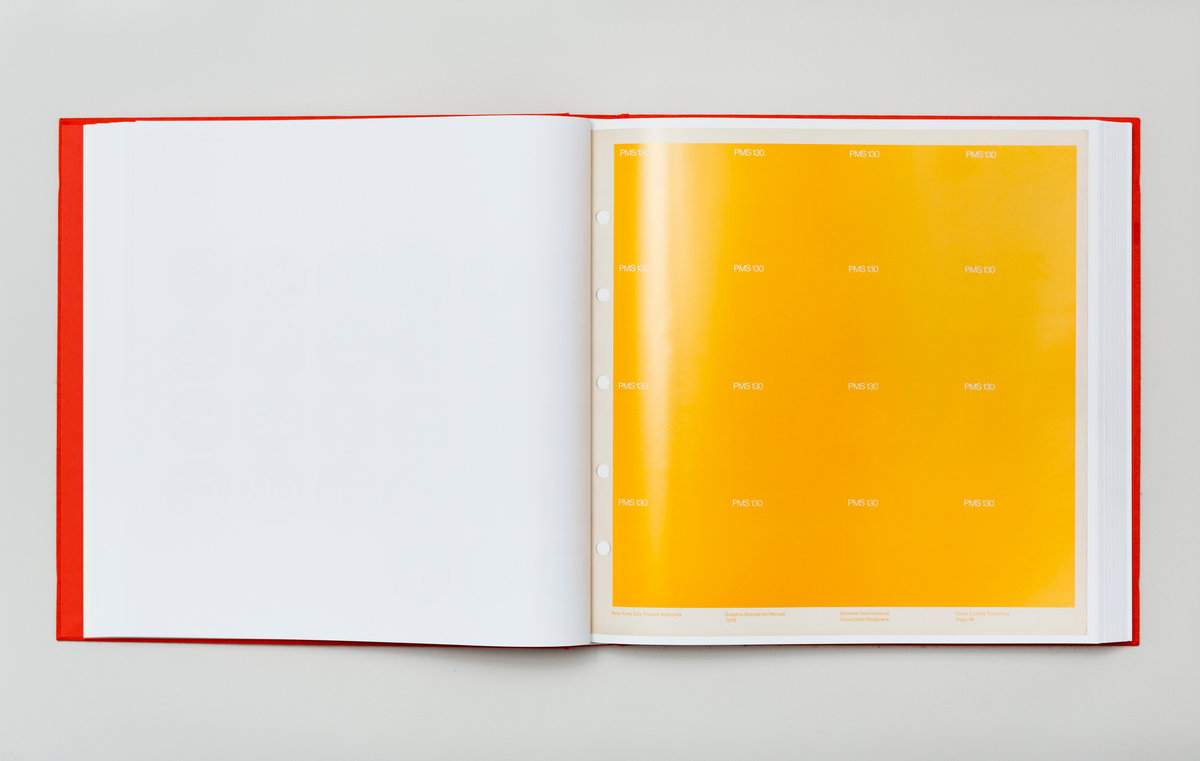
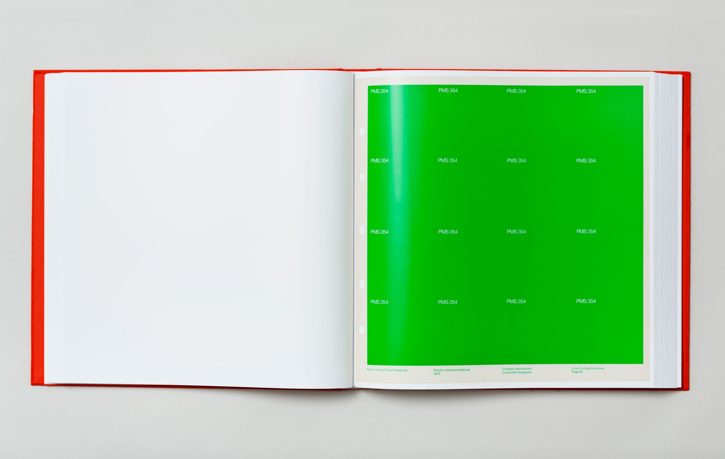
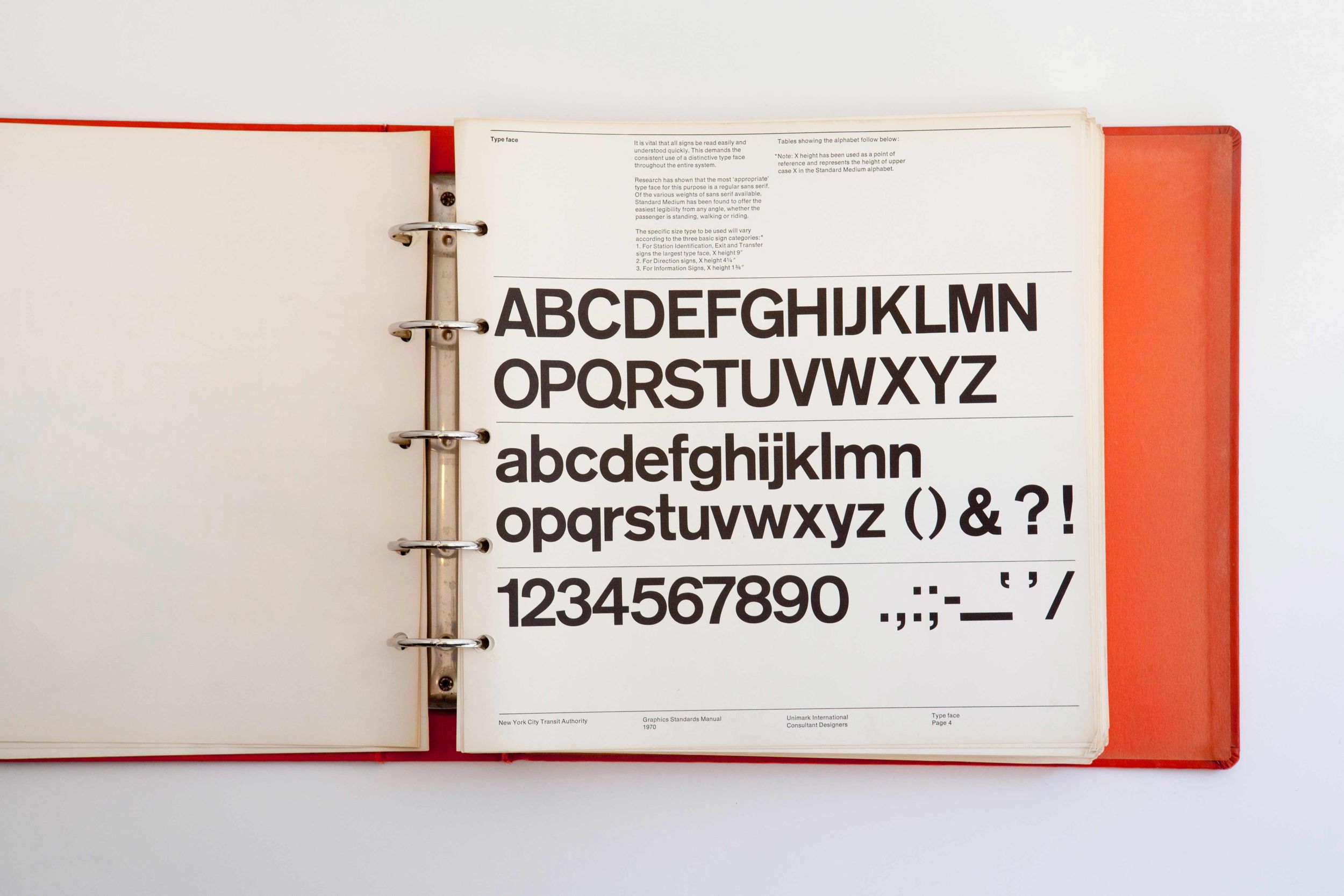
It speaks to the strength of this wayfinding system that it was invented in 1970 and is still being used today. It has been edited and has evolved over time to support infrastructure changes and improvement plans. Despite these revisions, its essence remains, and it is still widely used to help give directions to all busy New Yorkers and visitors alike. Standards Manual, an independent publishing imprint with a mission to archive and preserve artifacts of design history, recently published the NYCTA Graphics Standards Manual with scans of Massimo Vignelli and Unimark’s design. Highlighting the important contribution of this design to history, Standards Manual’s book includes images of the original style guide:
Healthcare Industry
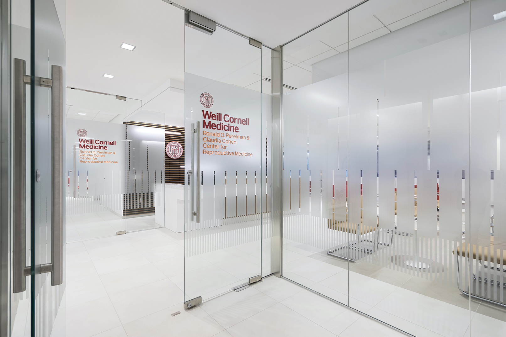
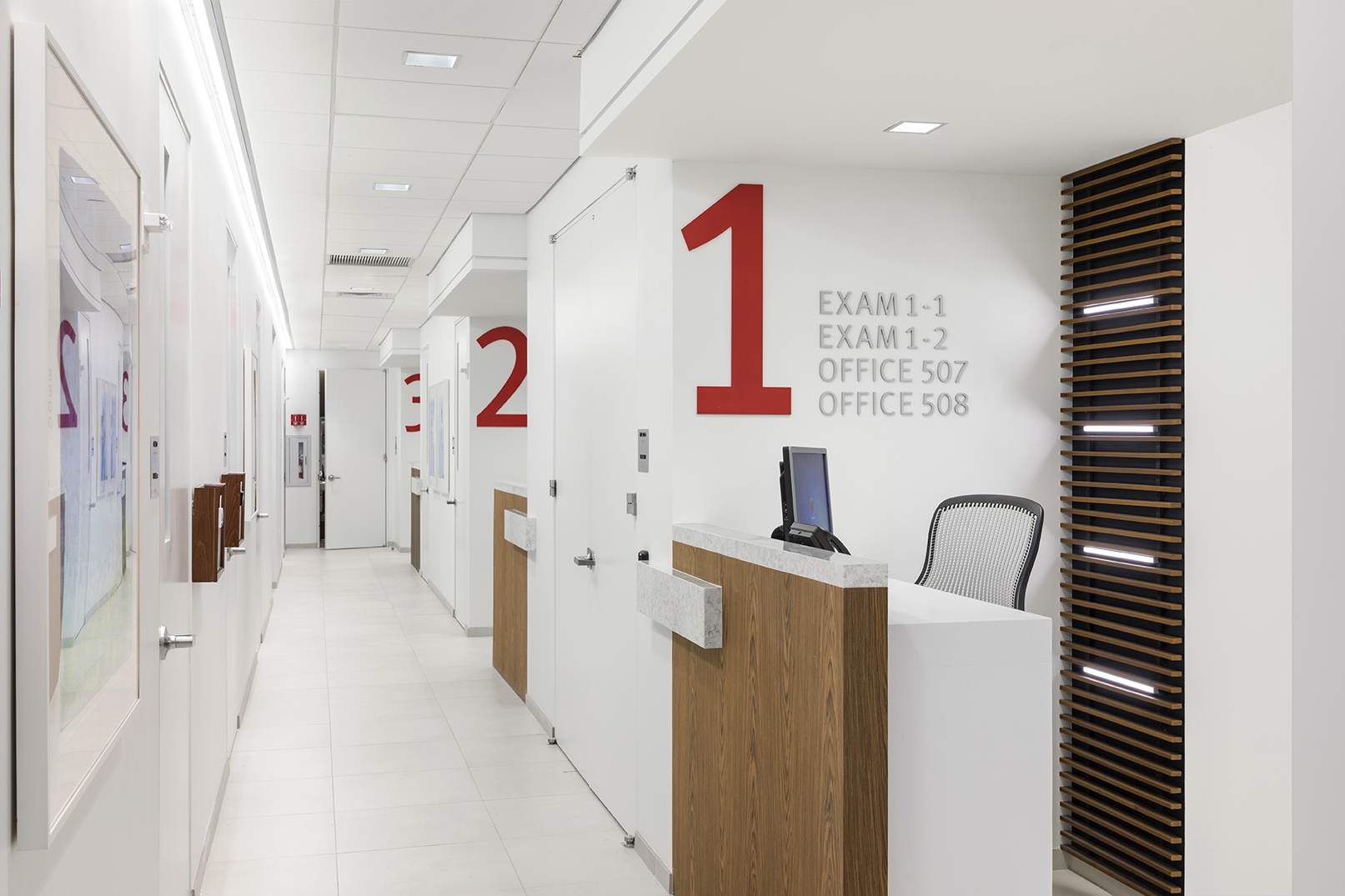
Wayfinding in Healthcare: Weill Cornell Medicine
Designer: BAM Creative – Ongoing Collaborations
Healthcare campuses present a unique set of challenges. Often, these environments have developed over time and encompass multiple buildings, some of them being old and some being brand new. This makes navigation among the buildings complex and regular upgrades are needed.
To respond to rapid changes in the hospital environment, staff ends up taping 8.5 x 11 temporary signs throughout the hallways, which compromises the effectiveness of the wayfinding system already in place.
“So many hospitals have overlapping layers of color paths on the floor, and/or on the walls, [and] signs that contradict other signs. Locations of people and departments in most hospitals is not a static condition. I often have told clients that they need to remove ALL signage and start over.
It’s really important that healthcare systems develop a system that is not dependent on the signage vendor. It has to be clear, flexible, and expandable” says Helen Cohen, AIA, LEED AP BD+C, Healthcare Practice Leader at BAM NY.
With Helen’s comments in mind, new technologies offer a clear, flexible, and expandable wayfinding option. An example is the use of electronic, readily editable screens that may be updated as needed, without taping up paper or waiting for a new sign to be installed. An additional benefit of screens is that content may be provided in multiple languages, creating a more inclusive patient experience. Another system to assist in the wayfinding experience uses the GPS in a smartphone to direct a visitor around a campus, although it is currently only available on newer campuses with the infrastructure to support this system. It is slowly being adopted more widely, and it opens doors to new possibilities for the healthcare industry to improve wayfinding.
Finding good case studies for healthcare can be challenging, due to the reasons Helen notes above. BAM created a compelling project at Weill Cornell with clear signage and effective wayfinding. To create an easier experience for visitors and staff alike, the large red numbers make it easy to direct people to different corridors by indicating the number. Using numbers for the corridors, exam rooms, and offices (as opposed to names) considers both flexibility and long-term use for the facility. Instead of having to swap out new signage should the department or staff change, the numbering is clear regardless of how the space is used.


Cultural Centers
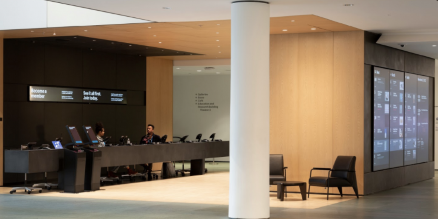
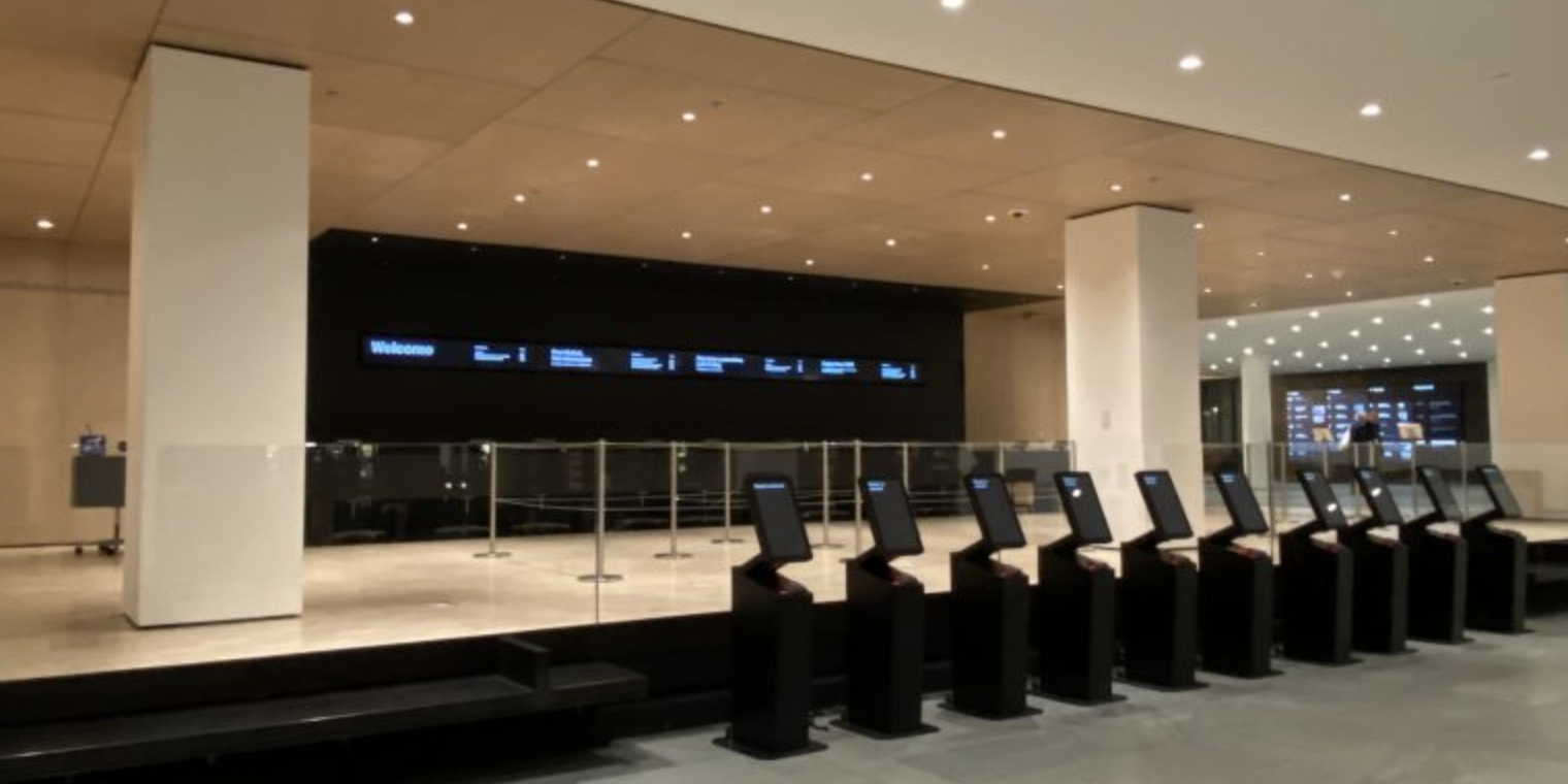
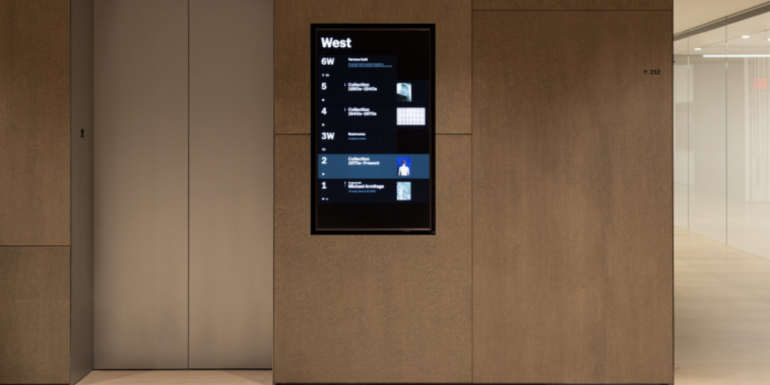
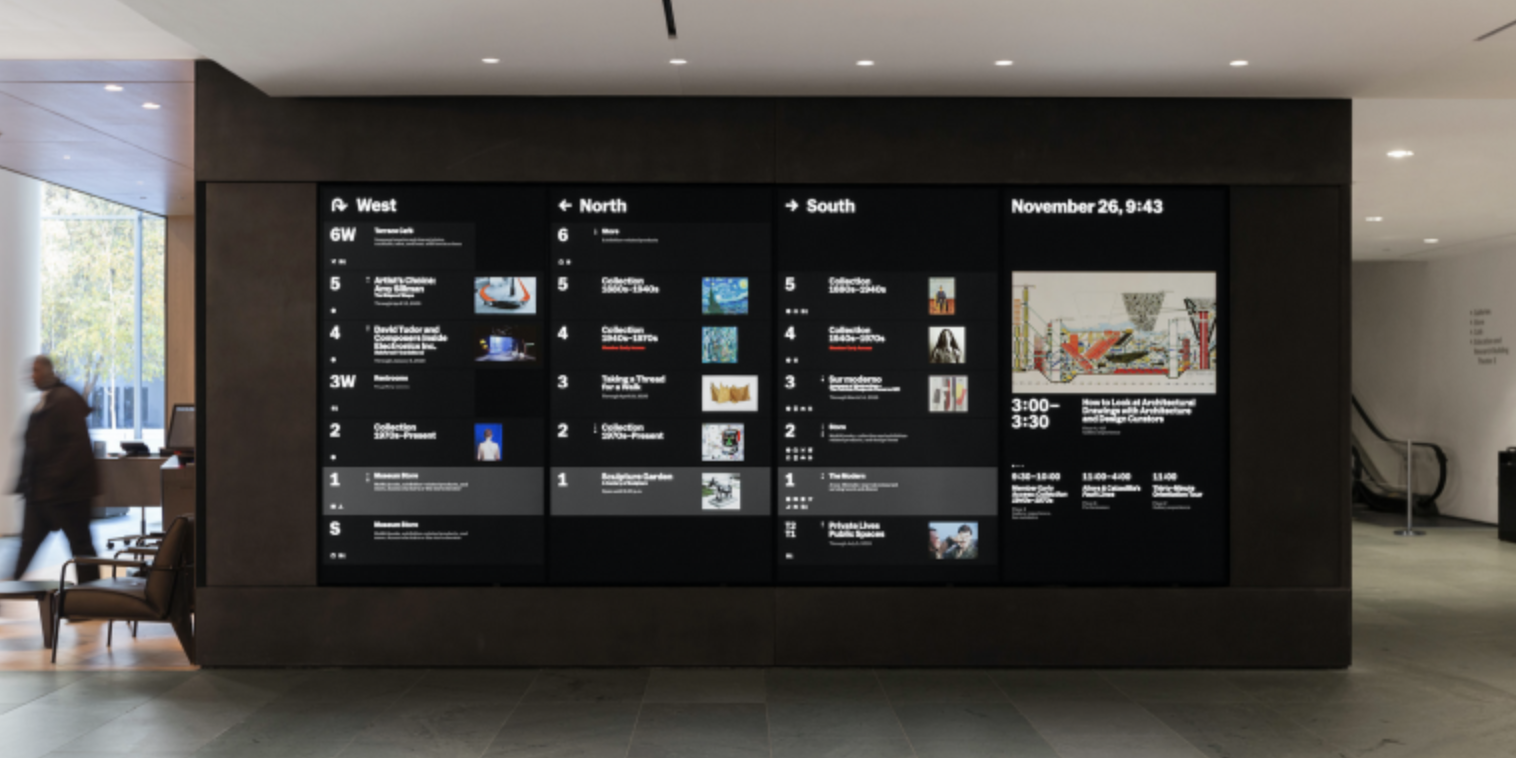
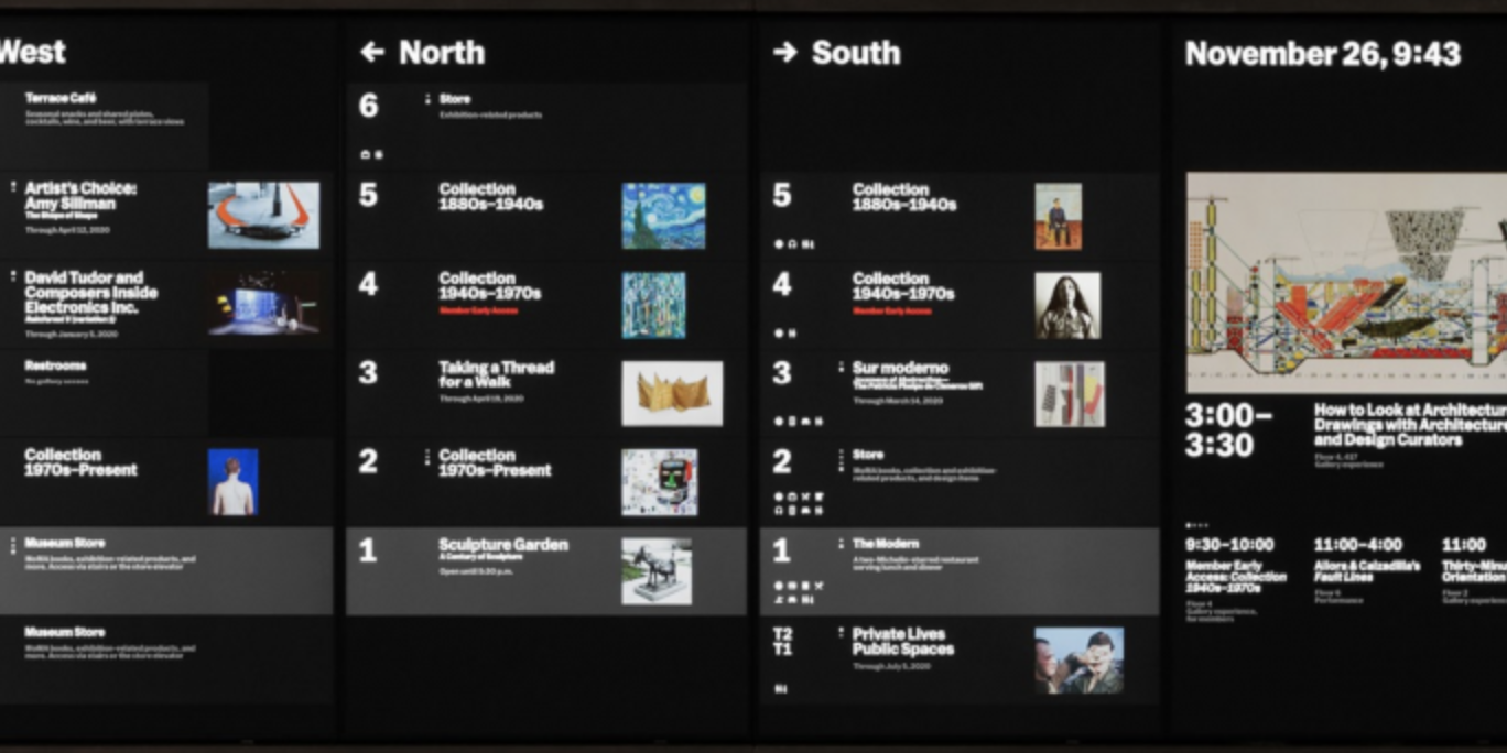
Wayfinding in Cultural Centers: MOMA
Museum Expansion and Brand Refresh – 2019
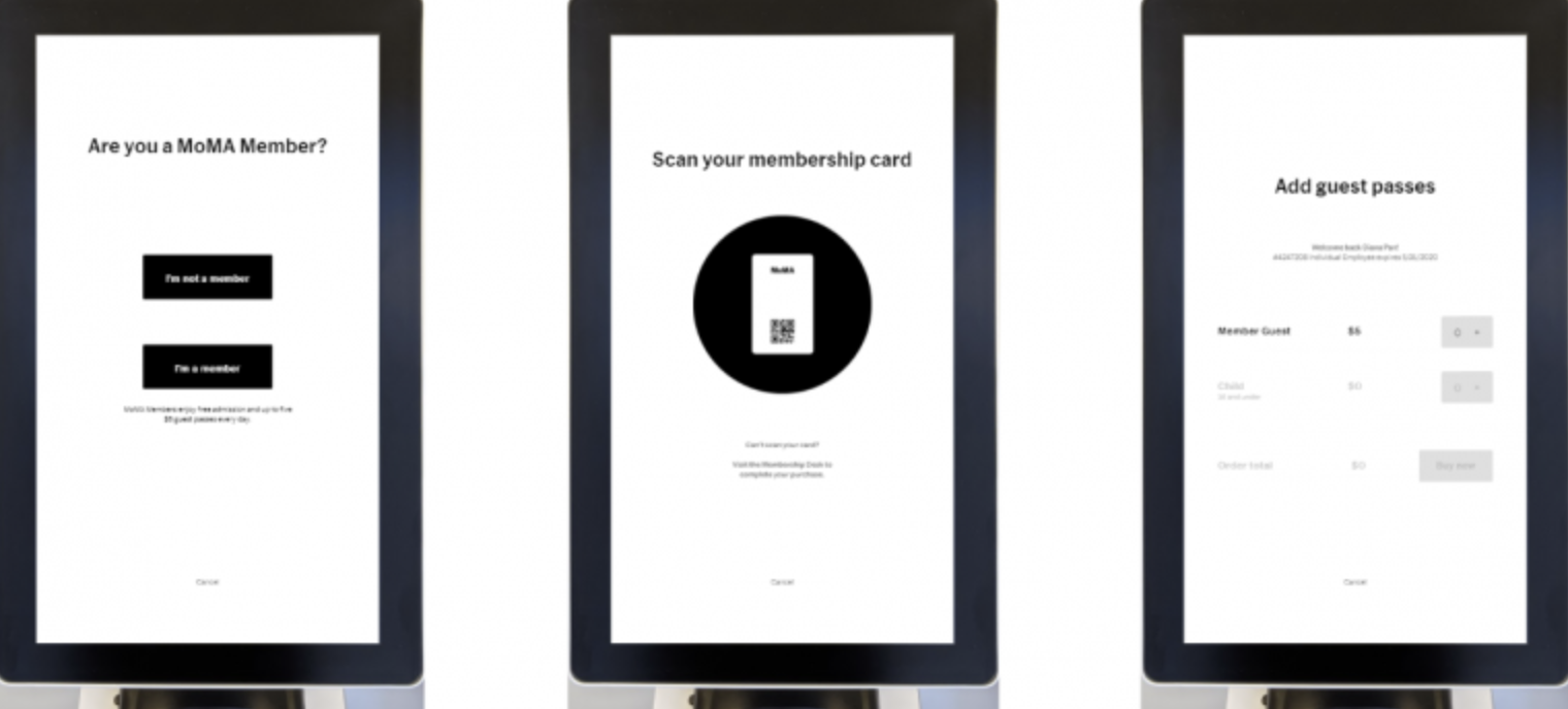
MOMA expanded the museum late 2019 and underwent a brand refresh at the same time. As a part of this project, new wayfinding systems needed to be installed. AIGA hosted an event with the internal creative team at MOMA that I had the chance to attend, and the event focused on the ramifications of an expansion and a brand refresh on wayfinding. As a part of this initiative, MOMA used a lot of digital tools that not only helped visitors to circulate around the museum but increased online customer acquisition for MOMA.
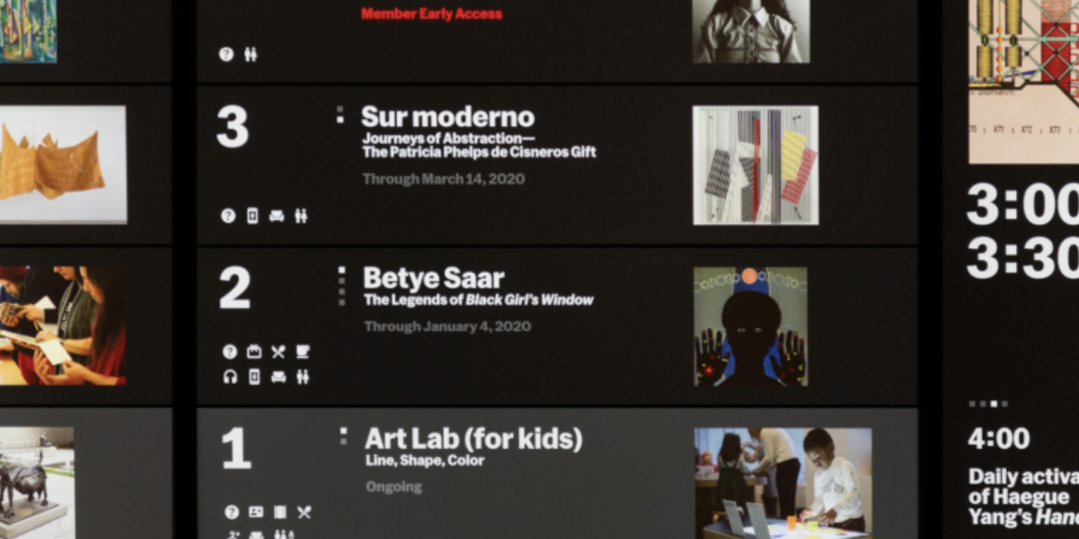
One element in the museum, that came up during an AIGA event in NYC back in 2019, that seemed very challenging for the creative team was the white labels printed beside each art piece. The MOMA team used to manage each label through an Excel document, and it sounded like a logistical nightmare. With the rebrand, they researched vendors to provide efficient systems to collect, manage and print these labels. They found a vendor who produced a Content Management System (CMS) that made the life of the creative team a bit easier in regard to label management. It was an interesting anecdote, as one would not think of the logistics of it all from a visitor’s standpoint.
Wayfinding and Our New Normal
Wayfinding After the Pandemic
The recent pandemic has greatly impacted how people interact with each other and within a space, due to social distancing and the reduced indoor occupancy. Touch surfaces have also become questionable and wayfinding needs to evolve and consider the new variables.
A study in 2019 from Markets & Markets found that the digital signage market is expected to increase from $20.8 billion in 2019 to $29.6 billion by 2024, growing annually at a rate of 7.3 percent. This number is likely to grow as interactive digital signage offers additional value during the pandemic.
Last month, the team at 22Miles released a whitepaper, Wayfinding Solutions & New Workplace Design, exploring the future of the workplace, building management post-pandemic, and how digital signage and wayfinding can be leveraged to support the logistical challenges facing enterprise workspaces, hospitality, education, and other industries.
Kiosks and displays positioned at entrances can serve as a first line of defense and communication.
Touchscreen Dilemma
With public touchscreens, used by a large number of people, an infected person could leave a virus on a surface and successfully infect another uncontaminated person without their knowledge.
Infectious disease epidemiologist Dr. Tara Smith from Kent State University said, “Since so many people are touching them day in and day out, they’re a great place for viruses and bacteria to be deposited by infected individuals and be picked up by healthy ones, spreading the germ to new people.”
In an attempt to combat potential spread, Dr. Smith suggested that companies should consider increasing hygiene measures for those using the screens, such as wipes on the stations. But until it is known for sure that companies are doing so, is it safer just to avoid touchscreens? Or do we have other options?
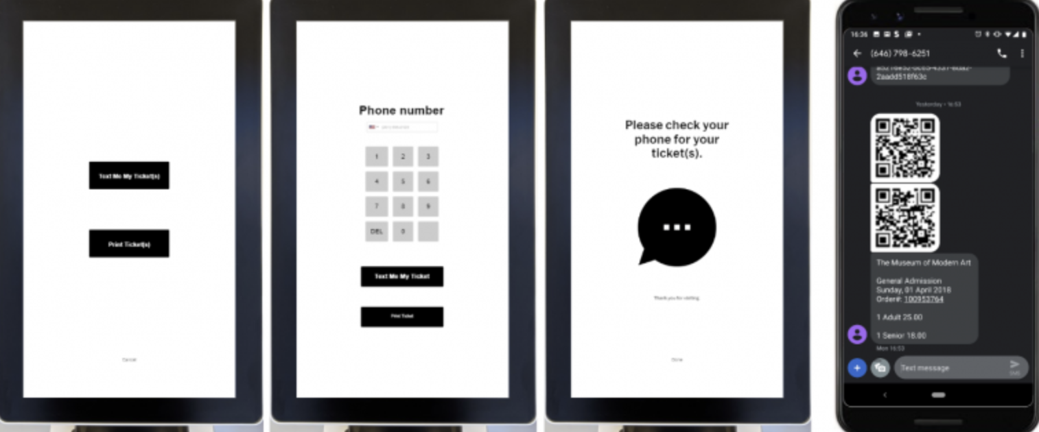
Mobile App Check Ins
Using the smartphone as a platform for interaction with a public-facing interface effectively confines the experience to a safe personal space. The average smartphone user touches their device 2,617 times a day. When coupled with the fact that smartphone owners already know how to perform the most basic input gestures on their phones, you’ve got the raw ingredients of a solution for interacting with shared systems that works for a broad swath of the public.
With the scan of a QR code, a smartphone becomes a remote trackpad with full multi-touch control of the shared screen. It’s a solution with a low barrier to entry and high ROI, both economical and eco-friendly. It even has the potential to make touchscreens more accessible to those with severe mobility issues, extending its usefulness far into the future.
Check-in or navigational apps are becoming the standard in industries such as healthcare. Google Maps AR navigation system can also be used within a built space to help direct patients and remove the contact with staff, keeping one-way navigation in mind.
Since many touchscreen technologies have already been installed, the other solutions to keep these investments running are to make them incredibly safe (even when touch is necessary) by using anti-microbial screens or to make them touchless. A few companies have created some solutions, including companies that now produce anti-microbial screen protectors and anti- microbial screen paint that kills germs. If the anti-bacterial solutions will be effective and reassuring enough to the public is not certain, and some other technologies should be considered, especially post-pandemic.
From Touch to Touchless Technology
Touchless technologies can be implemented onto current touchscreen signs already in place, allowing businesses to retain the return on investment on these machines by turning them into touchless devices.
New technologies such as a gesture control that is powered by cameras, using hand tracking and haptics or voice control are also good touchless alternatives. These might be more effective in quieter settings, as busy environments such as restaurants or retail could be challenging with the noise for voice control.
All these new technologies are still being tested and will evolve as the world adjusts to a new normal. One thing to watch is how these digital platforms bring wayfinding to a whole new level, where it not only has an informative purpose but also a marketing one. Technology and wayfinding combined can collect information about customers and can give accurate data which transforms the world of wayfinding in a major way.
In Conclusion
Safety and security are the pillars to strong wayfinding. A wayfinding system that is clear will make the user feel safe and secure navigating within the environment. Even more so, it can have a big impact on how a brand is perceived if carried through effectively and users can identify themselves with these brands and become ambassadors. Traditional wayfinding, such as static signs, are still relevant in today’s world and can help support businesses post-pandemic. Digital wayfinding tools, on the other hand, need to be updated and adjusted since the pandemic. It will require the use of new touchless technologies or the development of new mobile applications. People’s smart phones will become a source of safe navigation in the years to come. All these touchpoints can play a crucial role in a brand’s success. Wayfinding, and more specifically digital wayfinding, is evolving from an informative tool to a marketing/omnichannel tool which can help with customer acquisition and retention and will become a major part of any brands’ bottom line.